Tuesday, 13 January 2015

Yesterday's Jam

The characters in the IT crowd are mostly constructed as failing at one or more aspects of their life. Moss is constructed as failing at social interactions, Roy is constructed as failing with his anger management. We can see this because he goes on a huge rant about the people "up there" in the office, and how they have no respect for himself or Moss.

On the subject of Moss, it seems that he fails at social interactions as he takes everything completely literally, for example, he reads very deeply into Roy's "yesterday's jam" comment.  (Wow, 'Yesterday's Jam', that's the name of the episode!)

Both Moss and Roy are standard nerds as they work in the basement and have conversations about computers that the elder people of this Earth may not fully understand. They also don't dress entirely fashionably, and seem fairly socially inept.

Jen, on the other hand, completely fails at IT, which is why it's earth-shatteringly hilarious that she's been appointed as the head of IT. She doesn't even know what a hard-drive is, and therefore seems wholly unfit for her job.

Friday, 14 November 2014

I started by investigating brands target audiences in preparation for my own GCSE Media film. I need to plan how I will reach my target audience. As part of my films distribution, I will be devising marketing strategies such as reaching out to my audience through a film website, or a Facebook page.

In addition to profiling my audience I will work out why they enjoy the genre. Why would they want to watch my film? What makes it different, and how will it appeal to my audiences needs?

Who is my target audience?
My target audience is British males and females from 15-40+ who enjoy watching thriller films, YouTube thriller shorts, and adrenaline filled action films.

Why does my film stand out?
My films stands out because of the fact that it deals with the subject of a disease which is a current issue in todays society with the Ebola crisis and other similar situations.

Why should people watch my film?
Cinema Scope says "A truly terrifying look into n infected mind!"

Audiences can be segmented and defined by their GEARS:
Gender
Ethnicity
Age
Region/Nationality
Socio-economic group

My target audience consumes mass media platforms such as radio, so I investigated the target audience for Kiss which an example of a large niche audience.

My target audience most likely uses the internet to learn about film releases. For example, my friends and I who form the target audience for my film, find out about new releases on IMDb, Facebook, Twitter, and maybe even Tumblr.

10/9/14 | PLANNING | AUDIENCE PROFILE

Ethnicity: British
Age group: 15-70
Certification: 15 (BBFC)
Gender: All
Films/TV Programmes they watch: Retreat, Dexter, The Killing, The Walking Dead, Blood Simple, The Bourne Trilogy, Hannibal, American Psycho, Psycho, Batman, Inception
Music they listen to: Nicki Minaj, Kendrick Lamar, Eminem, D12, Alt-J, Darude,
In their leisure time they: Play computer games, surf the internet, play sports, eat McDonalds, eat Domino’s Pizza, play Magic The Gathering.
They are likely to wear: Topman, Topshop, River Island, Primark, Hollister, Zara
Media: iPhone, Blackberry, Macbook Pro, iMac, Desktop PC, Laptop


I think that my film would be of interest to this target audience because this covers most British teenagers. The film is a thriller film and not much of a niche, so therefore should appeal to most of our target market.

Wednesday, 12 November 2014

9/9/14 | RESEARCH | THE ART OF THE TITLE | "SE7EN"

The opening titles of David Fincher’s “Se7en” are highly stylised with lots of film grain, and dim lighting. All of the colours are lacking in saturation which makes the piece feel even more bleak. Most of the shots are short and snappy, using jump-cuts to skip out bits of time in the middle of each clip. This makes the sequence feel edgy and unsettling. The majority of the shots are macro shots of somebody putting together what seems like a scrapbook. We also see the person using a razor blade to remove the top layer of skin from his fingertips, hence removing his fingerprints. This lets us know that this person is most likely a criminal, who is highly skilled in the field of not being detected. This sets a dark tone to the entire sequence, and henceforth sets the tone for the whole film.

9/9/14 | RESEARCH | THE ART OF THE TITLE | "DETECTIVES"

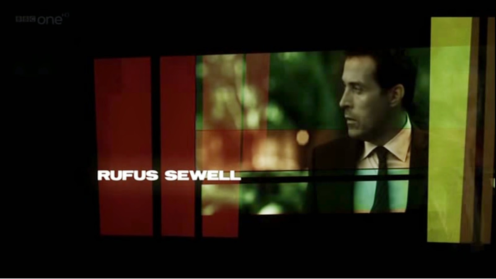
On “The Art of the Title” I watched the opening sequence to “Détectives”. It is set in Paris and has a modern look to it. It is made to resemble somebody browsing the streets of Paris using Google Street View. It also has a time-lapse feel to it. Each character is introduced by showing a picture of them along with their name. This gives the impression that the show is a comedy, or at least light hearted. This is backed up by the upbeat song which goes along with the title sequence. There has also been some colour grading on this sequence in order to give the whole sequence more of a detective feel alongside the comedy and upbeat feel.

9/9/14 | RESEARCH | THE ART OF THE TITLE | "SHERLOCK HOLMES"


In class today we watched the opening titles of Sherlock Holmes. As someone who is infatuated the work of Guy Ritchie, I must admit that I found this dumbfoundingly Earth-shattering. The opening was extremely stylistic. As each character is introduced, we see them in a moving image which then changes to a still, and then morphs into a drawing. The whole sequence has a sepia colour grade on it which helps us understand that it is set in the old days. Characters also wear Victorian clothes and the titles are presented using Victorian-style handwriting. All of these codes tell us that the era this takes place in is the Victorian era. The images also look slightly foxed, again to show their age.

9/9/14 | RESEARCH | TITLE SEQUENCES | "ZEN"


We watched the opening titles of "Zen" a crime drama set in Italy and made by the BBC. The opening titles are colourised like the Italian flag and also show snippets of landmarks in Italy which all give us clues as to where the show is set. We see a whole line of parked cars, all of which are Fiat's, an Italian make. The opening title sequence also has black bars going across it which resemble prison bars, adding to the theme of crime which the show follows. Also, we see silhouettes of handguns which seem to appear in a sort of x-ray vision, suggesting that people who seem normal could be hiding guns, and this also adds to the mystery and crime feeling of the whole show and most certainly adds the feeling of crime to the title sequence. We also so people sneaking around looking like they're hiding and spying on other people, adding to the suspense of the title sequence and also the rest of the show.


Tuesday, 11 November 2014

Shot List

Here is a screenshot of the shot list that we used to aid us when we were shooting the film opening. We made this shot list during pre-production.

Monday, 10 November 2014

Anaconda Productions Ident


Here are two screenshots taken from Adobe After Effects CS6 from when I was making the ident for "Anaconda Productions", our production company.

I used Video Copilot's "Element 3D" for the text, and created four different cameras. I moved them around in 3D space and cut between them at the pacing which I felt suitable. I enabled depth of field to give the piece a more realistic look.

I then added a particle system from CC Particle World. I changed the particle type to cube, and changed the radius of the emitter to a considerably larger one. I also increased the length of the particle life. I then added a gaussian blur to give the effect of the cubes being out of focus. Seeing as the effect works in 3D space, it worked perfectly with Element 3D and all of the cameras which I had set up.

I then made multiple new solids and switched them to 3D layers. I moved them to where I wanted in the 3D space, usually on top of a letter of the text, and applied Video Copilot's "Optical Flares" to them, in the colours and intensity that I felt was suitable for the look and feel of the project.

EDITING

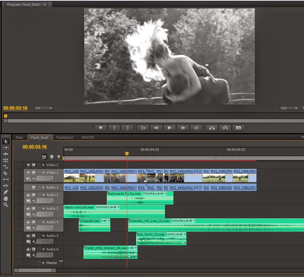
Here is a a general overview my screen in Adobe Premiere Pro CS6.
And a close up view of the timeline

As you can see, I am using three separate video tracks and eight separate audio tracks. Bright green clips represent other sequences that I had made earlier, in this case they were the flashback scenes.


On either side of this text there are two small screenshots of the two flashback sequences. I applied the tint affect to all of the clips in both sequences and changed none of the settings. This gives a black and white effect.


 One shot had to be done inside of Adobe After Effects CS6, and this was the shot of the TV turning on to reveal the public service announcement.

Originally the TV turned on to a blue screen which looked like this:

The idea came to me that I could use a keying effect to  use the blue screen as a "blue screen", and overlay the Public Service Announcement onto the top of it. I used Keylight 1.2 for this, as can be seen here:
You can see the finished product in the picture directly above this line of writing. I split the footage of the TV into two, so that the Keylight effect only kicked in after a second or two of the screen being blue, so as to give the effect of the TV having more time to boot up.

The colours of the film looked slightly warm, so I applied Colour Curves inside of Adobe Premiere in order to remove some of the red colour and also change the brightness and contrast.
It's slightly difficult to see but I have ever so slightly taken out some of the red midtones by pulling down on the middle of the red curve. I also darkened the overall midtones by pulling down the middle of the master curve.

 I have taken a screenshot of the clip before and after this effect was applied, and spliced them together down the middle so we can see the effect that this has on the look and feel of the film:
Original on the left, result on the right.
So overall we have a shot which looks like this:
This shot looks darker and better fits the overall tone and feel that we wanted to convey with the film. Then I thought some more about the fact that the film revolves around a virus, so decided to add a tint effect to the entire timeline in order to make the piece have more of a sickly feel to it. Again, I have made a before and after shot:


It's very subtle but you can see the line going down the center of the frame and brushing along the corner of Lily's eye (the eye closest to the camera).

The resulting shot looks like this:

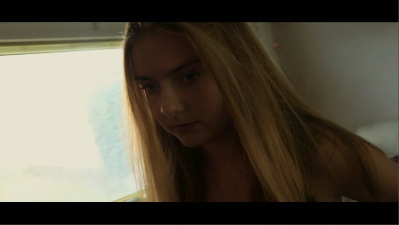
Finally I wanted to give the piece a more cinematic feel so decided to change the aspect ratio by cropping the image down. I cropped 10% off of the top, and 10% off of the bottom. This gives a "black bars" or "letterbox" effect which makes the entire production look more cinematic and widescreen.

And the finished product looks like this;

Thursday, 2 October 2014

CALL SHEET

CALL SHEET

Shoot Date: 20/10/14
Location: 
23 ******** Avenue, 
*******-on-Thames, 
Middlesex, 
**** ***

*THERE IS A GOOGLE MAPS SCREENSHOT HERE ON THE GENUINE COPY OF THE CALL SHEET BUT I DON'T WANT INTERNET STRANGERS COMING TO MY HOUSE SO THIS TEXT WILL HAVE TO SUFFICE*

Crew: Oliver Davis:          ***********    -  ********@gmail.com
Crew: Charlie Walker:      ***********   -   ********@gmail.com
Crew: Robert Tann:          ***********   -    ********@gmail.com
Crew: Lily Stojsavljević:  ***********   -    ********@gmail.com

Camera Equipment:
-Canon 70D
-Glidecam HD-2000
-Tripod
-Canon EF-S 18-135mm f/3.5-5.6 IS STM Lens
-Sigma 105mm EX DG OS HSM Macro Lens

Sound Equipment:
-RØDE NTG-3
-RØDE Blimp
-RØDE Micro Boom-Pole
-RØDE VideoMic Pro
-RØDE SmartLav+
-Dead cat/dead wombat
-Zoom H4n
-XLR Cable

Lighting Equipment:
-Every single light in the house
-iPhone torches

Props:
-Saw
-Plastic Wrapping
-A television

Wardrobe:
-Lily – Normal clothes

-Charlie – Normal clothes, makeup to look like an infected/dead person

Wednesday, 1 October 2014

10/9/14 | PLANNING | TREATMENT

We see a close up of a hand. It looks infected. We cut wider to reveal that the hand belongs to CHARLIE, 15, young, pale, and also dead. At the same time, LILY, 15, blonde and slim, wakes up on the sofa downstairs. She does not know where she is. The TV is on in the background and we hear a news report talking about a virus which is spreading across England. It also mentions that the government is executing anybody who is infected, or anybody who has come into contact with an infected person. Lily then goes upstairs to find Charlie's infected corpse. Fearing that the government are on their way to kill her, she decides to hide Charlie's body. After a few failed attempts she chooses to hide his body in the wardrobe. Upon opening it, she finds a pile of about 5 other dead bodies in there, and steps back in horror.

END

Wednesday, 24 September 2014

10/9/14 | RESEARCH | THRILLER FILMS

I made a Scoop.It to collect pieces of research about the horror genre. It is helpful to have all of my research in one place where I can find all of it easily in one concentrated area. Scoop.It is interactive and therefore makes suggestions.


Wednesday, 17 September 2014

9/10/14 | PLANNING | THE BRIEF

9/10/14 |  PLANNING | THE BRIEF
I am working with Charlie Walker, Robert Tann, and Lily Stojsavljević. We have decided to choose Brief 7 (video), the opening sequence of a new film including titles in any genre or mix of genres such as a comedy or thriller, together with a storyboard.
Maximum length: 3 minutes

We discussed the genre that our film opening would be. We discussed whether or not we would chose a horror or a horror-comedy. In the end we settled for a horror because a comedy is difficult. We discussed a few different possible scenes and also the props that we would need.

We have decided that we may well use an abandoned warehouse as a location and theme the film around Darude - Sandstorm. I have been appointed as the so-called "technical overlord", and Lily, Rob, and Charlie will be acting.

Wednesday, 18 June 2014

Question 1 - Spy Kids

The extract is a spy-comedy hybrid of the Action Adventure genre. Typical conventions include speed and motion when the helicopters attack Ingrid and Gregorio's wedding towards the end of the extract. People are quickly running around, as well as helicopters flying around the wedding. This is very typical of the AA genre as it creates excitement, and makes up the "action" part of the phrase "Action Adventure".

Another typical convention is suspense and jeopardy. This is created when both Ingrid and Gregorio jump off a cliff together. We are briefly lead to believe that this is the end of both characters, which creates a lot of suspense. The fact that they have just thrown themselves off of a cliff also puts them in great jeopardy. Luckily they soon open parachutes so are not in any real danger, but this is still typical of the AA genre.

Wednesday, 21 May 2014

Stereotypes

From the class blog, I have learnt the definition of a stereotype which is something along the lines of an oversimplified representation of a particular group of people. For example, a stereotypical Frenchmen may carry around a baguette and some garlic with him. There are also such things as anti-stereotypes which are the opposite, such as an old lady (as seen in Hot Fuzz) who keeps guns in the basket on her bike, instead of sandwiches and other items which OAP's tend to carry around on a bike with them. Stereotypes can often be taken as offensive but they are also useful as they help us easily understand different characters.

Monday, 19 May 2014

A comparison of how women are represented in fragrance advertisements from the 1920’s, 1970’s and 2012

I chose a 1920’s advert, a 1970’s advert, and a 2010 advert.

Mavis, Vivaudou (1920, Print, French)
The representation of the woman in Mavis is very much a product of its time in that the whole advertisement is in Art Nouveau style: the sensual organic curves, the oriental costume and the theatrical setting.

Unlike both of the other fragrances that I am comparing, this one is a painting, as opposed to a real life photo. It is done in an exotic manor with lots of curves and free flowing shapes. The woman in this poster also seems to be floating away as she is lifted up by a man that is dancing with her. This, combined with the curves which are all over this advertisement, represents the woman in this poster as being free, calm, light and relaxed.

The woman is also constructed as being exotic and free, wearing exotic, flowing clothing, and exotic jewellery. The way in which she is floating away, and her exotic clothes and surroundings, constructs her as almost dream-like, and surreal. The shapes and colours also seem very organic, as if they are of oriental origin, which is also very exotic, and the orient is a place where few people would have travelled to in that era.

She is being lifted up by another man, which represents her as being so attractive that every man in the world will want to dance with her and lift her up into the air.

The tagline at the bottom of the poster is “Irresistible”, which then represents the woman as being just that. It is saying that if you wear this fragrance, you will become irresistible to everything else that can breath. She is pale, slim, and seems well kept, which is what most women aspired to be like in the 1920’s.

Charlie, Revlon (1970s print)

The representation of the face of Charlie is very different from that of Mavis: the woman is alone, which represents her independence, she is in movement and her eyes meet the audience’s confidently. Her hair is also down and flowing which represents her as young and free.  Instead of the studied, highly stylized and elegantly sophisticated.

The representation of a woman wearing traditionally masculine clothes clothing (Trousers, and a jacket) shows her confidence that she can be feminine without resorting to traditionally feminine clothes. Her outfit is smart-casual, which would be fit to wear to work. This is different to the advert from the 1920’s, when  women tended not to work as much, however in this advertisement, the model looks very ready to boldly stride into the office and work. She is wearing a fashionable and sophisticated outfit and her pose constructs her as being free, in control, and confident.

The tagline is “The gorgeous, sexy-young fragrance.” Unsurprisingly, this constructs the woman as being gorgeous, and young, and sexy.  This is in contrast with the advert from the 1920’s, when women were more reserved, and less sexualised. Her hair is down and flowing which represents her as being young and free. She is also smiling which suggests that she is happy and laid back about life.

The background consists of trees, in a fresh, open-air garden, suggesting that the woman herself is also fresh, and clear-headed and calm.
This advert differs from the first advert as this one is a real photo, as opposed to a painting.

Gucci, Gucci, 2012 (moving image)
As this is a moving image advertisement and it is impossible to put a moving image onto paper, is shall analyse this using three screenshots from the advertisement.


The first screenshot from this advert represents the model as being very rich, wealthy, and powerful. The advert uses celebrity endorsement by starring Blake Lively, a well known model, to help connote power and riches.  The colour of gold is highly present in the city lights, and also her dress and her hair. Gold connotes riches and power. The view from the window which she is looking out of is also spectacular and only very high class, successful people would be in a place with such a stunning view.

Her pose is also open which suggests availability and confidence, which again fits in with the theme of her success and riches.

This advertisment is more similar to the 1920’s advert than the 1970’s advert, as this one seems somewhat surreal and out of the ordinary, something that “normal” people would never be able to achieve, and only this powerful, successful beautiful woman is able to have such a nice apartment with such a nice view and such a nice dress.  

Similarly to the advertisement for Charlie, her hair is hanging down loose, which also connotes, freedom, youth, and openness.


In this still, the model, Blake Lively, is walking through the desert and towards a large fan, on a photo shoot as she is a model. She is constructed as being very successful once more, as low-key, barely known models are not usually flown out to the desert just for a photo shoot. She is also very sexualised with her dress flowing backwards behind her, revealing her legs. Again, her hair is down and flowing.

She is striding towards the fan with incredibly confident, powerful body language which tells us that she is confident with herself, and she is in a position of power, instead of being treated as an inferior woman as many women were in earlier times.


The area around her is empty and a vast area, suggesting that she is clear headed, calm and collected. 

Friday, 2 May 2014

SPIDERMAN

One way in which the narrative fits the AA genre is that Peter Parker AKA Spiderman, is really just a normal person who happens to discover that he has insect-like powers. Whilst in pursuit of some villains, he discovers that he can shoot webs out of his hand and boldly decides to jump in at the deep end by swinging off the top of a very large building in order to find the evil people that he is trying to catch. This shows that our hero is very courageous and brave which is typical of the AA genre.

Another way in which the narrative is typical of the AA genre is that there is lots of suspense and jeopardy. Spiderman is still new to his powers and hasn't quite perfected his craft at this point, causing him to have many near misses. At one point he even jumps on top of a car which is participating in a high speed chase. This is usually dangerous as it's bad to even be in the car, and Spiderman, is standing on top of the speeding car. Traffic rushes as by as he is nearly thrown from the vehicle which creates a very tense situation with lots of jeopardy. Once more, this is typical of the action adventure genre which is to be expected in a Hollywood blockbuster such as this.

Friday, 4 April 2014

ASUKA - Analysis


  • My model represents my ideal target audience: her pose is open and relaxed which shows her confidence and self esteem.  
  • Her hair is down, hanging loose which connotes freedom and youth.
  • The model stands in a snow-covered field wearing traditional Japanese clothing which does not look very warm. This implies that she is so' hot' that she does not need to wrap up warm to walk outside.
  • The slogan 'Inflame Beauty' plays with the idea of fire and ice even more, 
  • as well as the red text, and orange patterns on her outfit which also resemble flames. 

NOTE: I may change the fragrance bottle.

I also made the bottle smaller because it is too large in the first photo of this post. The new product looks like this: