I started by investigating brands target audiences in preparation for my own GCSE Media film. I need to plan how I will reach my target audience. As part of my films distribution, I will be devising marketing strategies such as reaching out to my audience through a film website, or a Facebook page.
In addition to profiling my audience I will work out why they enjoy the genre. Why would they want to watch my film? What makes it different, and how will it appeal to my audiences needs?
Who is my target audience?
My target audience is British males and females from 15-40+ who enjoy watching thriller films, YouTube thriller shorts, and adrenaline filled action films.
Why does my film stand out?
My films stands out because of the fact that it deals with the subject of a disease which is a current issue in todays society with the Ebola crisis and other similar situations.
Why should people watch my film?
Cinema Scope says "A truly terrifying look into n infected mind!"
Audiences can be segmented and defined by their GEARS:
Gender
Ethnicity
Age
Region/Nationality
Socio-economic group
My target audience consumes mass media platforms such as radio, so I investigated the target audience for Kiss which an example of a large niche audience.
My target audience most likely uses the internet to learn about film releases. For example, my friends and I who form the target audience for my film, find out about new releases on IMDb, Facebook, Twitter, and maybe even Tumblr.
Friday, 14 November 2014
10/9/14 | PLANNING | AUDIENCE PROFILE
Ethnicity:
British
Age
group: 15-70
Certification:
15 (BBFC)
Gender: All
Films/TV
Programmes they watch: Retreat, Dexter, The Killing, The Walking Dead,
Blood Simple, The Bourne Trilogy, Hannibal, American Psycho, Psycho, Batman,
Inception
Music
they listen to: Nicki Minaj, Kendrick Lamar, Eminem, D12, Alt-J, Darude,
In their leisure
time they: Play computer games, surf the internet, play sports, eat
McDonalds, eat Domino’s Pizza, play Magic The Gathering.
They are
likely to wear: Topman, Topshop, River Island, Primark,
Hollister, Zara
Media: iPhone,
Blackberry, Macbook Pro, iMac, Desktop PC, Laptop
I think that my film would be of interest to this target
audience because this covers most British teenagers. The film is a thriller
film and not much of a niche, so therefore should appeal to most of our target
market.
Wednesday, 12 November 2014
9/9/14 | RESEARCH | THE ART OF THE TITLE | "SE7EN"

9/9/14 | RESEARCH | THE ART OF THE TITLE | "DETECTIVES"

9/9/14 | RESEARCH | THE ART OF THE TITLE | "SHERLOCK HOLMES"

In class today we watched the opening titles of Sherlock Holmes. As someone who is infatuated the work of Guy Ritchie, I must admit that I found this dumbfoundingly Earth-shattering. The opening was extremely stylistic. As each character is introduced, we see them in a moving image which then changes to a still, and then morphs into a drawing. The whole sequence has a sepia colour grade on it which helps us understand that it is set in the old days. Characters also wear Victorian clothes and the titles are presented using Victorian-style handwriting. All of these codes tell us that the era this takes place in is the Victorian era. The images also look slightly foxed, again to show their age.
9/9/14 | RESEARCH | TITLE SEQUENCES | "ZEN"

We watched the opening titles of "Zen" a crime drama set in Italy and made by the BBC. The opening titles are colourised like the Italian flag and also show snippets of landmarks in Italy which all give us clues as to where the show is set. We see a whole line of parked cars, all of which are Fiat's, an Italian make. The opening title sequence also has black bars going across it which resemble prison bars, adding to the theme of crime which the show follows. Also, we see silhouettes of handguns which seem to appear in a sort of x-ray vision, suggesting that people who seem normal could be hiding guns, and this also adds to the mystery and crime feeling of the whole show and most certainly adds the feeling of crime to the title sequence. We also so people sneaking around looking like they're hiding and spying on other people, adding to the suspense of the title sequence and also the rest of the show.

Tuesday, 11 November 2014
Shot List

Monday, 10 November 2014
Anaconda Productions Ident


I used Video Copilot's "Element 3D" for the text, and created four different cameras. I moved them around in 3D space and cut between them at the pacing which I felt suitable. I enabled depth of field to give the piece a more realistic look.
I then added a particle system from CC Particle World. I changed the particle type to cube, and changed the radius of the emitter to a considerably larger one. I also increased the length of the particle life. I then added a gaussian blur to give the effect of the cubes being out of focus. Seeing as the effect works in 3D space, it worked perfectly with Element 3D and all of the cameras which I had set up.
I then made multiple new solids and switched them to 3D layers. I moved them to where I wanted in the 3D space, usually on top of a letter of the text, and applied Video Copilot's "Optical Flares" to them, in the colours and intensity that I felt was suitable for the look and feel of the project.
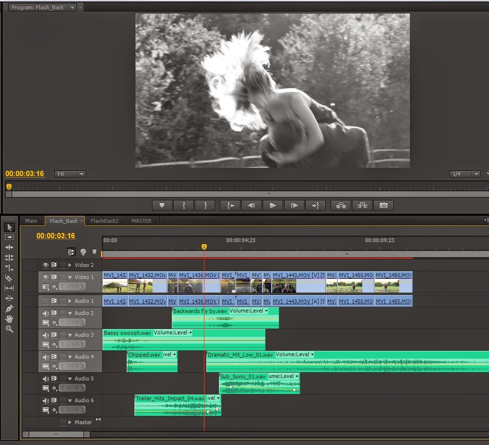
EDITING
 |
| Here is a a general overview my screen in Adobe Premiere Pro CS6. |
 |
| And a close up view of the timeline |
As you can see, I am using three separate video tracks and eight separate audio tracks. Bright green clips represent other sequences that I had made earlier, in this case they were the flashback scenes.

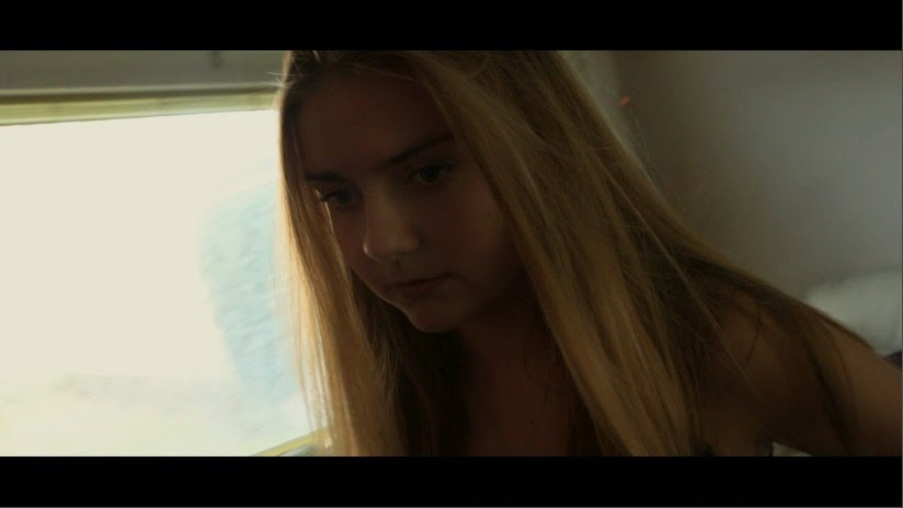
On either side of this text there are two small screenshots of the two flashback sequences. I applied the tint affect to all of the clips in both sequences and changed none of the settings. This gives a black and white effect.
One shot had to be done inside of Adobe After Effects CS6, and this was the shot of the TV turning on to reveal the public service announcement.
Originally the TV turned on to a blue screen which looked like this:

The idea came to me that I could use a keying effect to use the blue screen as a "blue screen", and overlay the Public Service Announcement onto the top of it. I used Keylight 1.2 for this, as can be seen here:


The colours of the film looked slightly warm, so I applied Colour Curves inside of Adobe Premiere in order to remove some of the red colour and also change the brightness and contrast.

I have taken a screenshot of the clip before and after this effect was applied, and spliced them together down the middle so we can see the effect that this has on the look and feel of the film:
 |
| Original on the left, result on the right. |


The resulting shot looks like this:

Finally I wanted to give the piece a more cinematic feel so decided to change the aspect ratio by cropping the image down. I cropped 10% off of the top, and 10% off of the bottom. This gives a "black bars" or "letterbox" effect which makes the entire production look more cinematic and widescreen.

And the finished product looks like this;
Subscribe to:
Posts (Atom)